Group Blog All Blog
|
การสร้างไฟล์ใหม่ และการกำหนดขนาดของภาพ
เริ่มต้นกับการสร้างไฟล์ใหม่ขึ้นมาหลังจากเปิดโปรแกรม ไปที่ File > New... จะได้หน้าต่างกำหนดขนาด ขึ้นมา สามารถกำหนดขนาดเป็น Pixel เป็น เซ็น หรือเป็น นิ้ว ก็ได้ สำหรับการทำ Wallpaper นั้นขนาดที่นิยมนั้นจะอยู่ที่ 800x600 pixel หรือ 1024x768 pixel  การเปิดไฟล์ที่มีอยู่ขึ้นมา ให้ไปที่ File > Open... ก็จะมีหน้าต่างให้เลือกไฟล์ มาลองเลือกไฟล์ภาพขึ้นมา 1 ภาพ  สามารถ ย่อ/ขยาย ไฟล์งานได้ โดยไปที่ Image > Image Size...  ก็จะได้หน้าต่างกำหนดขนาดขึ้นมา โดยในช่อง Width กับ Height ก็จะเป็นขนาดปัจจุบันของภาพ ซึ่งสามารถเปลี่ยแปลงขนาดของภาพได้โดยใส่ตัวเลขขนาดที่ต้องการลงไปแทน  สังเกตที่ช่อง Contrain Proporties หากได้ทำการติ๊กไว้ การกำหนดขนาดจะเป็นสัดส่วนกัน คือกำหนดขนาดของความกว้างอย่างเดียว ขนาดความสูงก็จะเปลี่ยนแปลงตาม ทำให้รูปได้สัดส่วนเดิม หากต้องการเปลี่ยนขนาดเฉพาะด้านกว้าง หรือเฉพาะด้านยาวก็ให้เอาเครื่องหมายถูกหน้า Contrain Proporties ออก ตัวอย่างภาพที่ถูกย่อแบบเป็นสัดส่วน กับย่อเฉพาะความกว้าง   การกลับด้านของภาพให้ไปที Image > Rotate Canvas > Flip Canvas Horizontal จะได้ภาพที่กลับด้าน  ถ้าจะกลับด้านเป็นแนวตั้ง ให้เลือกที่ mage > Rotate Canvas >Flip Canvas Vertical หรือถ้าต้องการหมุนภาพ 90 องศา เลือกที่ 90 CW ภาพจะหมุนตามเข็มนาฬิกา ถ้าเป็น CCW จะหมุนทวนเข็ม  หรือถ้าหากต้องการกำหนดองศาเองก็เลือกไปที่ Arbitrary.. แล้วใส่ตัวเลของศาที่ต้องการ  ก็จะได้เป็นภาพหมุนตามองศาที่ต้องการ   Photoshop
ในการทำภาพวอลล์เปเปอร์บางครั้งก็จำเป็นต้องอาศัยโปรแกรมตกแต่งภาพ ซึ่งโปรแกรมกราฟฟิกตกแต่งภาพต่างๆมีอยู่มากมาย แต่ที่นิยมใช้ และเป็นที่รู้จักกันมากมีอยู่ไม่มีกี่โปรแกรม และ Photoshop ก็เป็นหนึ่งในนั้น ในส่วนนี้จะนำเสนอ การใช้งานโปรแกรม Photoshop เบื้อนต้น ไว้สำหรับนักแต่งภาพมือใหม่ ได้ศึกษากัน หลายๆคนมีภาพที่ต้องการจะทำเป็นวอลล์เปเปอร์อยู่แล้ว แต่ทำไม่เป็น มาลองอ่านวิธีใช้โปรแกรมนี้ดู จะรู้ว่าการทำวอลล์เปเปอร์ง่ายนิดเดียว คุณเองก็สามารถทำได้ด้วยตัวเอง เพียงแค่มีภาพที่อยากจะให้เป็น wallpaper กับวิธีตกแต่งภาพให้สวยงามเหมาะสม คุณเองก็สามารถทำวอลล์เปเปอร์สวยๆไว้ประดับหน้าจอคอมของคุณได้แล้ว ไม่ต้องไปรอให้ใครมาทำให้ บทความทั้งหมดเป็นเพียงวิธีใช้งาน กับตัวอย่างเบื้องต้นเท่านั้น หากสนใจจะศึกษาต่อ มีเว็บเกี่ยวกับ Photoshop หรือเว็บกราฟฟิก ที่สอนโปรแกรมกราฟฟิกอื่นๆอีกมากมายทั้งเว็บไทยและเว็บต่างประเทศ โดยไปหาเว็บเหล่านั้นได้ผ่านทาง Graphic Link หรือจะเลือกศึกษาจากหนังสือที่มีขายทั่วไปก็ได้ - การสร้างไฟล์ใหม่ และการกำหนดขนาดของภาพ - การปรับขนาด และเปลี่ยนรูปแบบของหัวแปรง หรือหัวพู่กัน - การ ย่อ/ขยาย และการหมุนภาพ เฉพาะส่วนที่ต้องการ รู้จักกับการใช้งาน Layers - การใช้งาน Layers การ Copy และ Delete Layer - รู้จักกับการปรับค่า Opacity ของ Layers เพื่อทำการซ้อนภาพ การ Selection - การ Selection การตัด และลบ Selection - รู้จักกับเครื่องมือต่างๆที่ใช้ในการทำ Selection - การ Modify Selection - การกำหนดค่า Feather ให้กับ Slection เพื่อความกลมกลืน - การตัดภาพเฉพาะส่วนที่ต้องการ หรือเรียกว่าการทำการไดคัทภาพ - วิธีการ Save Selection และการ Load Selection มาใช้ Layer Style - การทำเงาให้กับภาพ เพื่อให้ภาพดูเหมือนลอยขึ้นมาจากพื้นหลัง - การใช้ Layer Style ทำภาพให้เป็นแบบนูนต่ำ - การใส่เส้นขอบให้กับภาพ หรือตัวหนังสือ การปรับแต่งสีและแสงให้กับภาพ - ปรับความ มืด สว่าง และ ความตัดกัน ด้วย Brightness / Contrast - ปรับความ เข้มและความจางของภาพด้วย Levels - ปรับแต่งแสง ด้วยเครื่องมือ Curves - ปรับแต่งแสงเงาให้เหมาะสมด้วยวิธีง่ายดาย ด้วยเครื่องมีวิเศษ Auto Levels - การปรับความเข้มจางเฉพาะจุดที่ต้องการ ด้วย Burn Tool และ Dodge Tool - การเปลี่ยนสีของภาพด้วย Hue / Saturation - การปรับสีแบบละเอียด ด้วย Color Balance - การเปลี่ยนภาพสีให้กลายเป็นภาพ ขาว ดำ การใช้ Filter ในการทำภาพ หรือตกแต่งภาพ - การทำพื้นลายไม้ เบื้องต้น - ทำภาพท้องฟ้าง่ายๆ ด้วย Filter Clouds - การใช้ Filter Lens Flare เพื่อใส่แสงแฟร์ให้กับภาพ - การนำ Filter Blur มาใช้ทำภาพชัดตื้น - การทำภาพให้เป็นลายอิฐ การสร้าง และการเรียกใช้งาน Pattern - การทำภาพให้มีลายเส้น เหมือนกับเป็นภาพจาก โทรทัศน์ - การใช้ Pattern ทำ ลายตาราง ลายจุด - ทำพื้นหลังง่ายๆ แต่หลากหลาย ด้วย Pattern ข้อความ - การทำข้อความให้นูนขึ้นมาจากภาพพื้นหลัง - การปรับแต่งข้อความธรรมดาให้ โค้ง ให้ซิกแซก หรือเป็นลูกคลื่น ด้วย Warp Text Highlighted Chrome
1.
This technique can be applied either to text or any other "thing" you'd like to add some cool chrome to. For the purposes of this tutorial, I'll be using text in my example, however feel free to apply the technique to any other shape.  2. On the new channel fill the selection with white, then deselect (CTRL +D). Go to Filter » Blur » Gaussian Blur, and use a radius of 8. Repeat Filter » Blur » Gaussian Blur, this time using a setting of 4. Again, Filter » Blur » Gaussian Blur and enter 2. Aaaaannnd, you guessed it... once more Filter » Blur » Gaussian Blur and enter 1. When you've completed this, go back to the Layers palette and click on the type layer. 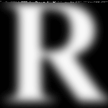 3. Now with the type layer active, go to Filter » Render » Lighting Effects and use these settings. 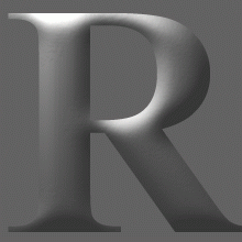 4. Next go to Image » Adjust » Curves and match your settings with those in the example below... by this point things should be starting to look a lot more like chrome. You can, of course, alter the curves as you wish, as long as you're happy :) 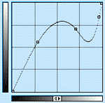 5. Now that the chrome is all set, it's time to add the highlight. Go to Filter » Render » Lighting Effects and use these settings. I've made a Lighting Effects setting similar to what is used in the tutorial, that you can download and use if you're stuck. The Lighting Effects menu doesn't have an option to load settings though, so you'll need to follow a few quick steps. 6. That's it - just resize your type down to about half the size and add a drop shadow.  7. As I mentioned before, you don't have to use this effect only on text. Here is something completely different that I made using this effect, this time applied to a fancy shape.  8. You don't have to stop there though. You can add a whole other level of depth and detail to your design by creatively messing around with Photoshop's layer styles. A few suggestions to get you going... perhaps try Satin (with lower than default opacity), or some variations with the Inner Shadow, Outer Glow, and Inner Glow. Also consider a Gradient Overlay, with low opacity and an angle such as -35. Make sure to also try the different blending modes, as most will look more interesting than Normal. On Inner Shadow, consider raising the Choke value for a really cool looking angular bevel effect. It's amazing how many great looking ideas you can come up with while digging around in the various Layer Style options. Remember that you can save snapshots of any cool ideas you come up with along the way - just press the New Style button (and don't forget to save them all later by clicking Styles at the top left of the window, clicking the arrow button to the right, and choosing Save Styles. Here's an example with many of the above suggestions applied:  Easy Plastic Text with Layer Styles
In this Photoshop text effects tutorial, we're going to learn how to Here's the effect we're going for:
Let's get started. Step 1: Open A New Photoshop DocumentThe first thing we need to do is open a new document, so
Adobe Photoshop Text Effects: Create a new Photoshop document. Step 2: Fill The Document With BlackPress the letter D on your keyboard to
Adobe Photoshop Text Effects: Press "Alt+Backspace" (Win) / "Option+Delete" (Mac) to fill the new document with black.
Step 3: Add Your Text To The DocumentGrab your Type tool from the Tools
Adobe Photoshop Text Effects: Select the Type tool from Photoshop's Tools palette. Then, with the Type tool selected, go up to the Options
Adobe Photoshop Text Effects: Choose your font in the Options Bar. Press the letter X on your keyboard to
Tips on How to Buy Your First Set of Wood Carving Tools
|
ชีวานรินทร์
 ผู้ติดตามบล็อก : 3 คน [?] ผู้ติดตามบล็อก : 3 คน [?] Link |


))
))